It begins with a word
Maktūb (مَكْتُوب) means “it is written.” In everyday Arabic it can simply mean something written down; in faith and culture it also carries a quieter sense of what is destined with care—not fatalism as an excuse to drift, but trust that serious intentions belong in writing.
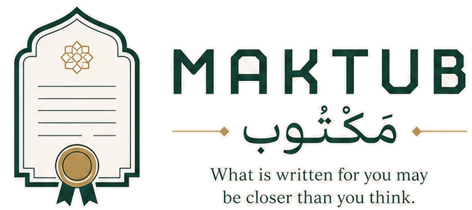
We named the product after that idea, then designed a mark that looks like a document rather than a dating badge. If the name means written, the symbol should look written too.
A certificate, not a heart
Most dating apps reach for hearts, sparks, or faces. Those signals train people for entertainment. Maktub is for people seeking a path toward marriage, so the mark borrows from a nikāḥ certificate: a formal frame you might see on a marriage document, not a flirt icon.
The arched top echoes a mihrab—the niche that marks direction and intention in a mosque. Here it is not mosque clipart; it is a threshold shape. It suggests that approaching marriage deserves the same clarity of facing toward something that matters.
Lines that look like writing
Inside the frame sit short horizontal rules—the visual shorthand of text on a page. They are not decorative stripes. They stand for the written record: names, witnesses, agreement, the seriousness of putting a life decision into words.
That detail also mirrors how we want the product to feel. Profiles, Salaam, and family involvement should read more like careful correspondence than an infinite scroll of faces.
The star, the seal, and the ribbons
At the crown of the mark sits a gold Rub el Hizb—the eight-pointed star long used to mark sections in the Qur’an. In our lockup it stands for guidance and division with care: clarity, not spectacle.
Below, a gold seal with green ribbons closes the composition the way a wax seal closes a letter. One focal point. One act of commitment. That is closer to how we think about introductions—few, deliberate, and meant to be taken seriously—than to a feed that never ends.
Colour with purpose
Forest green (#1C5346) carries the frame and wordmark: grounded, calm, and grown rather than flashy. Soft gold (#C8A96A) marks the star and seal—warmth reserved for what is precious. Warm cream (#F5F3EF) is the paper the certificate sits on.
Beside the mark, Reem Kufi sets both MAKTUB and مَكْتُوب. One brand, two scripts, same weight of intention. We avoided gradients, hearts, and loud effects so the symbol stays quiet enough to live on a favicon and serious enough to stand for marriage discovery.
It is written.
Why our mark is a marriage certificate—not a heart: the mihrab arch, Rub el Hizb star, written lines, gold seal, and the colours that carry the name maktūb.
Join the founding cohort